 |
Handwriting Without Tears for Grade 1 - Without headlines, Tessa's tall letters are inconsistent and often way too tall.
|
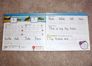
After looking and thinking, looking and thinking, I finally bought a Zaner-Bloser for Grade 1 handwriting workbook for her. The font isn't too terribly different. I had Tessa continue to form letters the Handwriting Without Tears way. The pages are four-color, feature cute little illustrations and the lessons are easy to divide into smaller portions. It was a breath of fresh air...for about a week. What was the problem? Zaner-Bloser prints on high-gloss paper, which is very SLICK. In addition to concentrating on proper letter formation, Tessa worried about her pencil slipping across the page. It wasn't worth the frustration. We had no choice, we chucked it. After a one-day jump back to the Handwriting Without Tears for Grade 1 workbook (needless to say, that didn't go so well...again), I decided to copy the remaining Handwriting Without Tears for Grade 1 content into ZB FontsOnline Plus, which is Zaner-Bloser's wonderful free online worksheet maker. I love that I can adjust the line spacing by choosing different grade levels.
We pressed on with my revised Handwriting Without Tears worksheets. Every time I pulled one out, Tessa broke out into a fit of uncontrollable itches and yawns. It was a struggle for her to form one full letter without some part of her body itching. I took this as a sign that I needed to find something drastically different. More looking and thinking...


We started 15 Reproducible Cut & Paste Mini-Dictionaries this past week. I divided the words among three days, so Tessa copies five themed words every other day. She also hones her hand and finger muscles by coloring, cutting and pasting the corresponding pictures into the booklet. Although I think she knows, I've been careful not to call it handwriting. I think I'm on the right track, as she actually asked to work on her mini dictionary first the second day. My plan is to rotate the eBooks above every couple of weeks to stem off monotony.
 |
| After writing the selected words, Tessa colored the corresponding pictures. |
 |
| Then, she cut them out. |
 |
| Finally, Tessa pasted the pics into her mini dictionary. |
Update: We have since abandoned most of the Scholastic eBooks mentioned above. As fun as they were, the line-spacing used in them is ginormous. After trial and error, I discovered Tessa's handwriting is better when smaller. I switched back to creating my own handwriting worksheets with ZB FontsOnline Plus. I use the line spacing for Grade 3. In addition to copying specific letters and words, I allow her to practice a little creative writing...she gets to create her own sentences using words she selects from word banks. Handwriting is going quite a bit better now.


No comments:
Post a Comment